
Are you looking for bullet journal fonts to add that WOW factor to your pages!? Here are a few that you can easily do yourself.

When I first started to make a bullet journal, the thing that intimidated me the most was the beautiful fonts I saw on other’s pages. I never learned how to write in cursive growing up, and as a left-handed person, I have to work really hard to not smear my handwriting as I write.
The first step is to find the right pens. For myself as a left-handed person, I need pens that dry quickly and do not smear easily. So, I avoid gel pens at all costs. You also want to make sure that the pens will not bleed through the paper. I always make sure to buy a bullet journal with 160gsm paper in it so I can create bold fonts that will not bleed through. (You can even use watercolor paint on pages this thick.) It’s the worst when you spend precious time creating something only to discover it bled through and ruined the page on the back!
Once you have the layout of your bullet journal page and the color theme, grab a pencil and pick a font. I always prefer to start with pencil to ensure that everything looks exactly right and is centered on the page, before going over it with the pen. Check out some of my favorite, easy bullet journal fonts that add some WOW factor to your pages!
Bullet Journal Fonts with Color

The first way to add some WOW to your bullet journal pages is to use fonts with color markers. Personally, I love using dual tip brush pens because it is convenient to have the two ends with different sizes. They are also soft and lend well to shading and fancier fonts as well. I love adding pops of color or even a more neutral color like olive green. The first step is to decide what your overall theme is for the page you are working on. Will you use stickers or washi tape for decoration? If so, try to decide what specifically you will use, and then pull accent colors from that.
I love to use the Style A font option for my bullet journals because it is so simple. The letters are very straightforward without any fancy flourishes. The only thing you need to decide is how many lines high you want them to be. You can draw them out first in pencil if that makes you feel more comfortable, but once you get the hang of it you should be good to jump straight to using your marker.
After you draw the letter, then you add a thin line to the right side of every angle to create an almost shadow look. It really makes the font pop off the page. Another fun way I like to change this font is to do it in black and do the shadowing with a bright pop of color.
A little fancier…

Now for Style B in purple, the letters are still very simple and straightforward. Again, they should be relatively easy to do with the marker, but feel free to do them in pencil first. Once you have the word written out, then go back through with a pencil and write the fancier, lower case letter through the middle. Unlike mine, you will connect these letters together when you write an actual word in your bullet journal. Then trace back over it in black.
Finally, I love to use Style C in this green font with flourishes to make my page look fancier. Again, you start with the color marker and decide how tall you want your letters to be. Draw the section of the letter that is colored, and then go back through with a pencil and add the flourishes. At the end, you trace back over it in black.
Bullet Journal Fonts with a Calligraphy Look
While I have been teaching myself a little bit about calligraphy, I still need a lot more practice. From the beginning, these faux calligraphy techniques work really great to make your bullet journal pages look how you want without spending a ton of time on the fonts.
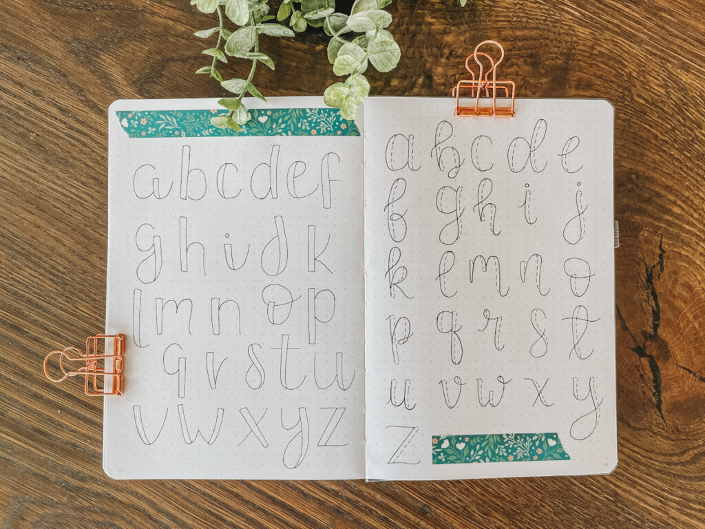
For the Style D font, using a pencil, you write each letter and make one side of it thicker, with a double line. You can choose to leave this double space hollow, or fill it all the way in. Either way it looks great! Trace over it with black ink once you have the letters the way you want them to look.
The Style E font is another faux calligraphy look, but with dashed lines instead. I love using this look because it is still really simple to execute, but also has a lighter look to it. Again, take a pencil and draw the main skeleton of the letter. Then, to the right side of each line, you draw a dashed line out to the side to thicken it. Trace over it all with black ink.
Bullet Journal Fonts with Chunky Letters

Sometimes you just need a good font for your bullet journal. Something that grabs your attention quickly and looks great too. Both of these chunky fonts do just that, but also look totally different from each other. Either one of these bullet journal fonts would look great in color too.
The Style F font is pretty straightforward. Each letter has a thick stripe that is colored in. Then the rest of the letter is completed with a thin black line. I definitely like to draw this font out in pencil first. A few of the letters are a little trickier to get the spacing where it looks good. But I love that bold black stripe that gives it a chunky look that really stands out on the page.
Finally, the Style G font is a quirky one that I feel drawn too when I want a more whimsical look. I love that each letter has a miniature letter within it. The key to this font is to definitely use a pencil so start. Once you decide how many lines high you want your letters, draw them out in pencil first. I always like to start with the straight sides first, then connect them if there are curving lines. Then, notice that the miniature letter within each is much bolder. I use a wider brush pen to achieve this look, and then go back to the thinner pen to do the rest of the letter.
Which font style is your favorite overall? Let me know in the COMMENTS.
Check Out More Posts Like This:
- Bullet Journal Supplies You Need to Get Started
- How to Start a Bullet Journal
- Make a Bullet Journal Monthly Spread
- Make a Bullet Journal Weekly Spread
- How to Draw Basic Bullet Journal Banners
This post contains affiliate links, which means I make a small commission at no extra cost to you. See my full disclosure HERE.
Shop this Post:
- Favorite bullet journals
- Favorite pens
- Favorite markers
PIN IT FOR LATER

Beautiful! Thank you so much for the inspiration!
You’re welcome!!
I have always loved everything handwriting and calligraphy. This is such a timely reminder for me to get back into it. Thank you!
It’s so fun and relaxing to do in the evening after the kids are in bed. Gives me a creative outlet and helps me feel like I accomplished something.